

The best shade color doesn’t have to match the walls. When choosing a color for window shades, use the walls for a soft, blended look or the trim for a more architectural finish. Either can work when it fits the room’s palette. A shade slightly lighter or darker than a nearby surface can also add subtle depth.
Color can seem like a small decision until a shade sits alongside the floor, cabinetry, furniture, and changing daylight. The goal is a cohesive look that doesn’t feel flat or introduce contrast that competes with the details you love.
This guide explains how to coordinate shade colors with walls, trim, floors, furnishings, and natural materials while considering how each room is used. Learn when to blend or contrast, how light and dark tones affect a room’s mood, and why texture and opacity matter alongside color. These details can help you choose a shade that suits the atmosphere you want in each space.
Key Takeaways
- Choose whether shades should blend with the walls or echo the trim, then use a related tone to keep the palette cohesive.
- Use floors, cabinetry, and furnishings as color cues; repeating an existing finish can create harmony, while a considered accent adds definition.
- In a neutral room, a darker shade can draw attention to the windows. In a room with a strong focal point, a quieter tone lets it remain the star.
- Let each room’s purpose guide opacity and material: consider how much light, privacy, and softness the space needs.
- Explore natural woven textures alongside wood tones, and consider custom drapery when the window needs an additional layer of color and texture.
1. Colour Matching Blinds: Walls or Trim?
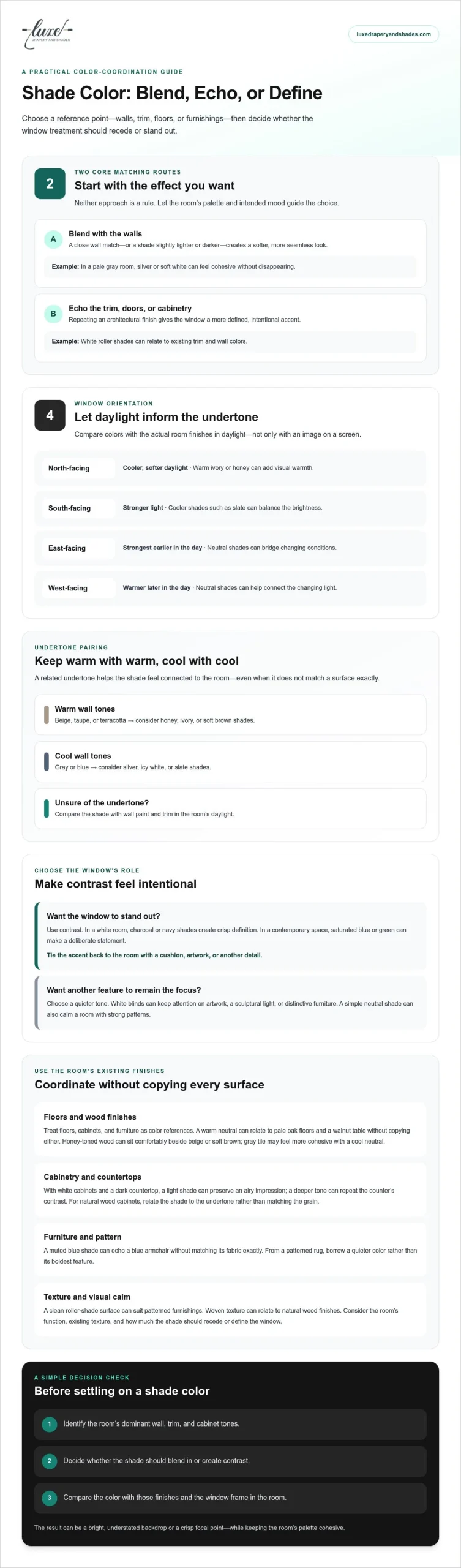
Start with the effect you want. Matching a shade to the wall color helps it blend into the room, while matching it to trim, doors, or cabinetry creates a more defined architectural accent. Neither approach is a rule. Choose the surface that best supports the room’s palette and intended mood.
For a seamless finish, choose a shade close to the wall color or slightly lighter or darker. In a pale gray room, silver or soft white can feel cohesive without disappearing. If the walls are bold, cream, sand, or dove gray can soften the contrast. A shade that matches bold walls instead creates a more immersive look.
Window orientation can help guide your color choice. North-facing windows receive cooler, softer daylight, so warm ivory or honey can add visual warmth. South-facing windows receive stronger light, which can balance cooler shades such as slate. East-facing light is strongest earlier in the day, while west-facing light grows warmer later. Neutral shades can bridge these changing conditions.
Warm and cool tones work best when their undertones make sense together. Beige, taupe, and terracotta walls pair naturally with honey, ivory, or soft brown shades. Gray and blue walls often suit silver, icy white, or slate. If undertones are hard to identify, compare the shade with the wall paint and trim in the room’s daylight instead of relying on a screen image.
In a kitchen, consider cabinet color and wall paint before settling on a shade. White cabinets and warm beige walls, for example, can work with ivory shades that relate to both finishes. To emphasize the cabinetry, echo its color; to keep the window quieter, choose a light neutral that complements the cabinets without matching them exactly. White roller shades can also complement existing trim and wall colors.
Popular U.S. choices include white, cream, and pastel shades for a soft, refreshing effect, alongside adaptable neutrals such as beige and taupe. Black is also appearing more across window-covering categories as new-construction homes favor black windows; matching black shades can visually quiet the window frame.
Before deciding, identify the room’s dominant wall, trim, and cabinet tones, then decide whether the shade should blend in or contrast. Compare the color with those finishes and the window frame. This simple process makes choosing a color for window shades more deliberate, whether you want a bright, understated backdrop or a crisp focal point.
2. Matching blinds to flooring, cabinets, and furnishings
Floors, cabinetry, and furniture create a room’s visual foundation, so use them as color references rather than matching every surface exactly. In a living room with pale oak floors and a walnut coffee table, for example, a warm neutral shade can relate to both woods without copying either finish. This connects the window treatment to the room while letting each material retain its character.
Start with the largest, most permanent finishes. Note whether the floor reads warm or cool, light or dark, then compare it with nearby cabinets and furniture. Honey-toned wood flooring can sit comfortably beside beige or soft brown shades; gray tile may feel more cohesive with a cool neutral. For tile or laminate, smooth, clean-lined shades can support a modern look and echo the floor’s crisp surface.
Cabinet color matters especially in kitchens, where the window often shares sightlines with counters and fixtures. With white cabinetry and a dark countertop, a light shade can preserve an airy impression, while a deeper tone can repeat the counter’s contrast. If cabinets are natural wood, choose a shade that relates to their undertone rather than matching the grain precisely. This helps the window feel distinct from the cabinetry.
Trim and molding offer another useful cue. Blinds close to the trim color can appear integrated with the room’s architecture, particularly around white casings. If the trim is stained wood, pick up its warmth with a compatible shade color or texture. A contrasting shade can work too; repeat its color in a nearby detail, such as a chair cushion or lamp base, to make the choice feel intentional.
Use furniture and decor to introduce a controlled accent. In a neutral room with a blue armchair, for example, a muted blue shade can echo the upholstery without requiring an exact fabric match. A patterned rug may include several colors; select a quieter tone from its pattern rather than repeating its boldest feature. This creates a connection without adding visual competition—a cohesive approach that interior styling teams like Pair Home Design use when curating spaces for maximum visual appeal.
Color is only one part of the decision. Consider the room’s functionality, the amount of visual texture already present, and whether the shade should recede or define the window. Roller shades bring a clean, simple surface to rooms with patterned furnishings, while a woven texture can relate to natural wood finishes. For a tailored treatment that coordinates with surrounding furnishings, explore custom roller shades.
3. What Color Should My Roller Shades Be?
Use contrast when you want the window to become a focal point. In a white room, charcoal or navy shades create crisp definition; in a contemporary space, saturated blue or green can make a deliberate statement. Balance the contrast by repeating that color in a cushion, artwork, or another accent. Without a second connection, a bold window covering can feel isolated.
For a quieter effect, let the shades support the room’s existing focal point. White blinds can keep attention on a painting, sculptural light, or distinctive furniture. If the room already has strong patterns, such as a striped rug and floral upholstery, a simple neutral shade gives the eye a calmer surface. White shutters against colored walls offer another way to frame a window with clean contrast.
Color alone doesn’t determine glare or heat control. Consider the shade’s material and opacity: window blinds can help regulate temperature, while black roller shades can block nearly all light. Blackout options are suited to bedrooms or media rooms when stronger light reduction is wanted. Their darker appearance may feel heavy in a bright kitchen or sunroom.
Black can work especially well with black window frames. Matching the shade to the frame can make the mullions visually recede, creating a more continuous outline. In a room with white walls and dark floors, medium-light shades can provide contrast without adding another deep area. Conversely, a bright room can support darker shades and richer wall tones without feeling cramped.
White and light-colored shades aren’t automatically more likely to show dust. White roller shades are described as easy to clean and less likely to show dust than darker shades. Dust visibility and discoloration are different concerns, so don’t assume color predicts how a shade will change over time.
To choose a shade color for a specific room, identify its strongest visual feature, such as a navy sofa or a large painting. Then decide whether the window should blend in or draw attention. Compare a sample with the wall, floor, and window frame in the room’s daylight. A warm neutral can soften a high-contrast room, while a contrasting hue can define a plain wall. Finally, consider whether light control or a subdued backdrop matters more in that space.
A white roller shade paired with a white cassette headrail can visually disappear at the top of a window. Bold, contrasting blinds can create a lively atmosphere in a modern or contemporary home.
4. Choosing opacity and materials for room function
Choose opacity based on the room’s needs for daylight, privacy, and atmosphere. Light-filtering shades soften incoming sunlight while preserving a bright feel; room-darkening or blackout shades are better suited to bedrooms and media rooms. In a family room, an earth-toned, light-filtering shade can add softness without making the space feel closed. Color should complement the walls, cabinets, and furnishings, while opacity determines how much light passes through.
Shade color affects a room’s appearance, while opacity shapes daylight and privacy. A light-filtering shade can admit natural light while offering daytime privacy; a room-darkening option provides a deeper visual screen. For a street-facing bedroom, consider the desired privacy and level of darkness. For a sunny kitchen, a light-filtering option may preserve a fresh atmosphere better than a heavy blackout treatment.
Gray roller shades come in room-darkening and light-filtering options, so the same color can serve different functions. Pair light gray with pale walls for a calm, understated effect, or choose deeper gray when brighter finishes can balance it. Compare the shade’s texture with nearby materials: smooth surfaces suit clean-lined decor, while a subtle weave can complement wood furniture or natural-fiber rugs.
Room size can also guide your color choice. Light-colored treatments can make a small room seem larger, while light shades and neutral walls can help a dim room feel more spacious. In a compact office with dark flooring, a pale neutral shade can lift the overall impression. A darker shade can feel elegant in a bright, generous room, but may make a small, low-light space feel more enclosed.
Consider how the room’s palette works as a whole, not just how the shade looks against one wall. In a kitchen with cream cabinets and a pale stone counter, a warm neutral can connect the finishes. In a bedroom with cool gray walls and navy bedding, a soft gray shade can echo the palette without adding another strong color. A woven texture can add depth when the room mainly features smooth finishes.
5. Natural wood tones and woven wood blinds
Natural wood brings visible grain and warmth to a window, so coordinate its tone with the room’s existing materials. Honey-colored woven shades can echo oak floors, while deeper brown tones can relate to walnut furniture or a dark wood table. The goal isn’t to match every grain exactly. Instead, repeat the wood’s warmth or depth so the window feels connected to the room.
Start by identifying the wood’s undertone. Golden oak and maple often read as warm, while some gray-washed finishes feel cooler. A warm natural weave can complement a beige rug and cream walls; a cooler, muted wood tone can sit comfortably beside gray flooring and slate accents. If a room mixes woods, select the finish that appears most often or provides the strongest visual anchor.
Texture matters as much as color. Woven wood shades introduce a natural pattern that can soften smooth surfaces such as painted cabinetry, glass, or polished tile. In a room with a prominent jute rug or rattan chair, a fine weave can reinforce the natural-material palette. If the room already has strong textures, such as a pronounced wood floor and patterned upholstery, a simpler shade finish can keep the overall look composed.
Use lighter natural tones when you want the window treatment to feel airy against darker floors or furniture. A pale woven shade above a walnut console, for example, creates separation while staying within the room’s warm palette. Deeper shades can add definition to a bright room with white walls and light upholstery, especially when another detail, such as a wood-framed mirror, repeats that depth.
When selecting a shade, compare its color and weave with the floor, furniture, and nearby fabric in the room’s natural light. Hold the sample vertically beside a window, then place it near a wood finish or textile. This reveals whether its undertone feels too red, yellow, or gray. Even a small difference can change how the woven surface complements surrounding materials.
Woven wood shades can provide a tactile, organic layer; drapery can add softness and another opportunity to bring in color. For example, neutral panels beside a natural weave can balance its texture, while a fabric accent can echo a rug or upholstered chair. If you’re ready to explore natural woven finishes for your windows, discover woven wood shades and consider how their color and texture can bring the room’s materials together.
Luxe Drapery and Shades: Custom Drapery
Luxe Drapery and Shades helps bring a considered color palette to life through custom drapery, roller shades, Roman shades, and cellular shades. These options suit windows that need a tailored finish, or spaces where color, texture, and light control should work together. For example, custom drapery can add a fabric accent beside a neutral shade, while a Roman shade offers a composed look that complements the room’s furnishings.
Share the colors and finishes you want your window treatment to relate to, along with the atmosphere you’re creating. This gives the design conversation a clear starting point, whether you’re refining one room or coordinating several. Contact Luxe Drapery and Shades to explore a window treatment suited to your space.
Let the Window Complete the Room
A window treatment can do more than finish a room. It can express the balance you want between softness and structure, calm and contrast, or natural texture and tailored detail. As you continue choosing a color for window shades, think beyond what looks right in a sample. Consider the feeling you want to return to each day, and let that intention guide your decision.
Begin with the room that feels closest to complete, then consider how its windows contribute to the whole space. A thoughtful design choice can bring harmony without making every room alike. Luxe Drapery and Shades can help shape a refined treatment around your home and personal style.
Contact Luxe Drapery and Shades to take the next step toward windows that feel beautifully at home.
Frequently Asked Questions
Colour Matching Blinds: Walls or Trim?
Choose a color close to the walls for a softer, less conspicuous finish, or close to the trim when you want the window to feel more architectural. If a room opens directly into another, consider how the shades look from both spaces, not just beside one wall. Choosing a color for window shades becomes easier when you decide which view matters most, then compare color samples with the wall and trim in the room’s natural light.
What Color Should My Roller Shades Be?
Choose a roller shade color that supports the room’s focal point and overall mood. In a room with colorful artwork, a quiet neutral can keep attention on the art; in a restrained space, muted green or blue can add character. If several windows share one sightline, using the same shade color across them creates a composed look, even when nearby rooms have different palettes.
Should window shades match the walls, trim, or flooring?
They don’t need to match one surface exactly. Pick the finish that gives the room its strongest visual cue: pale trim can frame the window, while a distinctive floor can guide the shade’s warmth or depth. In a room with mixed finishes, choose a shared quality, such as a warm undertone, rather than copying every color. This links the elements without making the scheme feel overly coordinated.
Do light or dark window shades make a room look bigger?
Light shades generally help a small or dim room feel more open, especially when they relate to pale walls. Dark shades can add depth and definition, but may make a compact room feel more enclosed. In a narrow space, keep the window treatment visually close to the wall color. In a spacious, bright room, a deeper shade can create a striking frame without overwhelming the setting.
How do you coordinate shade colors with curtains and furniture?
Give each element a role instead of matching every color. For example, pair a neutral shade with curtains that echo an accent in a sofa or rug. Alternatively, keep the curtains understated and let a colored shade carry the accent. When layering, consider how the fabrics look together in daylight and after dusk; a shared undertone can unite different textures without requiring identical colors or patterns.
Which shade colors reduce glare and heat best?
Color alone doesn’t determine glare or heat control; material and opacity matter. Black roller shades can block nearly all light, while blinds can help regulate temperature.